Gwangju city main library
Gwangju, republic of korea
spawton architecture concept 2020
Client: Gwangju Metropolitan City
Sijo – Current Melodies
Korean literature has its roots in folk tales and more specifically, in poetry. There are four major traditional poetic forms: hyangga (“native songs”); pyolgok (“special songs”), or changga (“long poems”); sijo (“current melodies”); and kasa (“verses”).
The concept design for the Gwangju Main Library is shaped by the notions of one of these verse forms, Sijo. Originally intended as songs, sijo explore cosmological, metaphysical or pastoral themes. The library represents these themes, the “current melodies” central to the idea of a modern library.
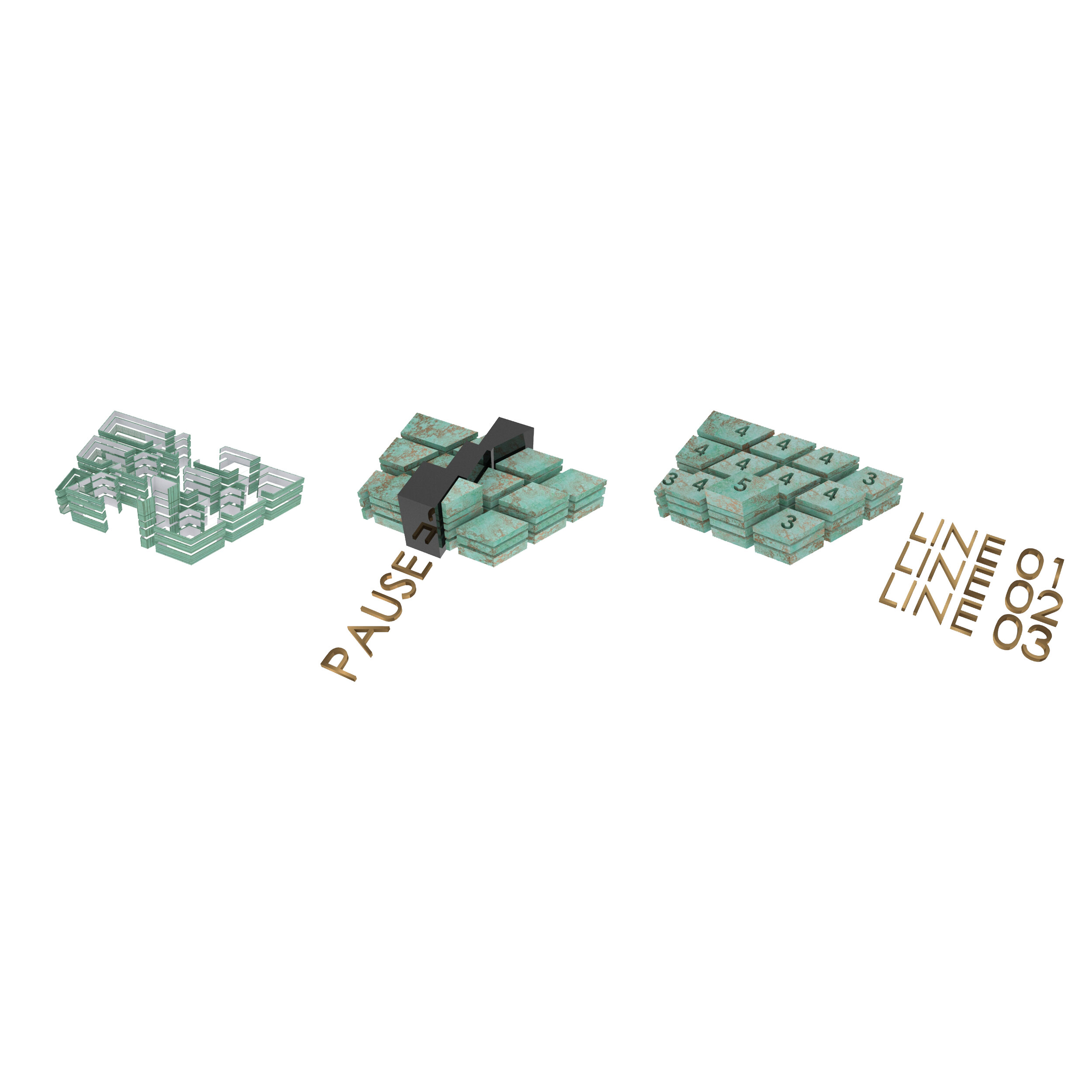
Sijo is structured in three lines of 14-16 syllables with a total of 42-48.
Line 1 introduces a situation (3,4,4,4 syllables).
Line 2 elaborates and develops the theme (3,4,4,4 syllables).
Line 3 employs a twist or a counter theme in the first half (3,5 syllables) which could be a surprise, a sound or other device. The second half of the line provides the conclusion (4,3 syllables).
Each line should have a pause or a break.
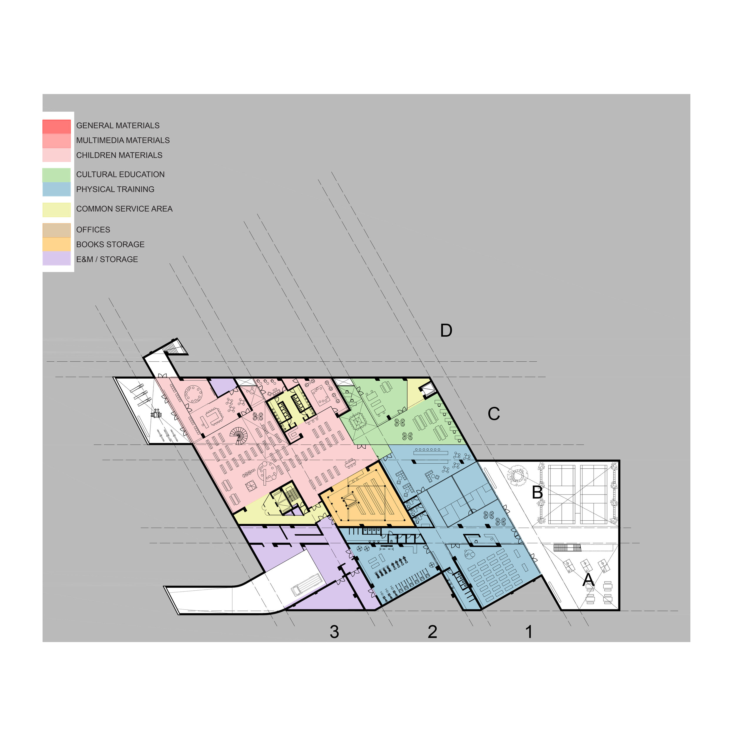
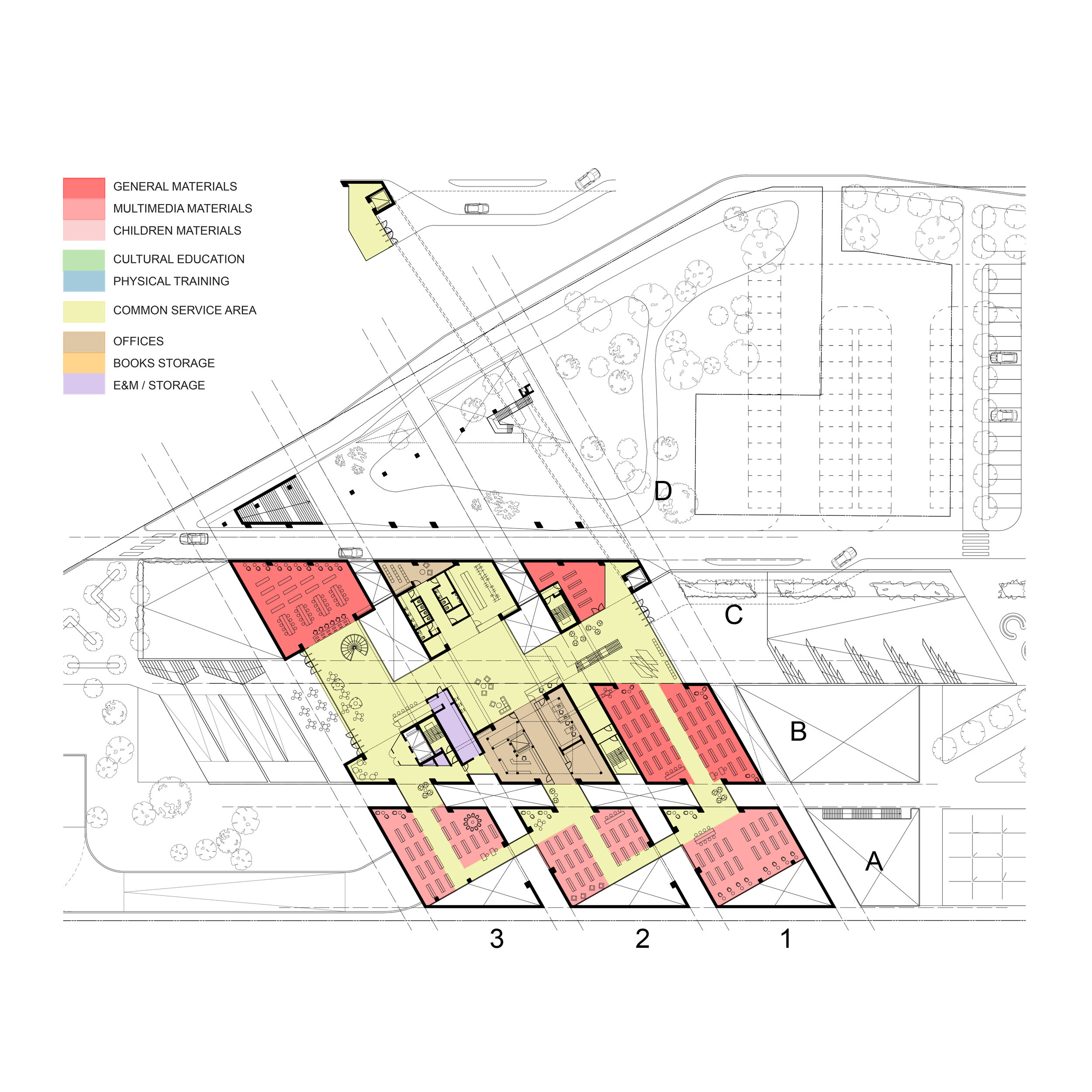
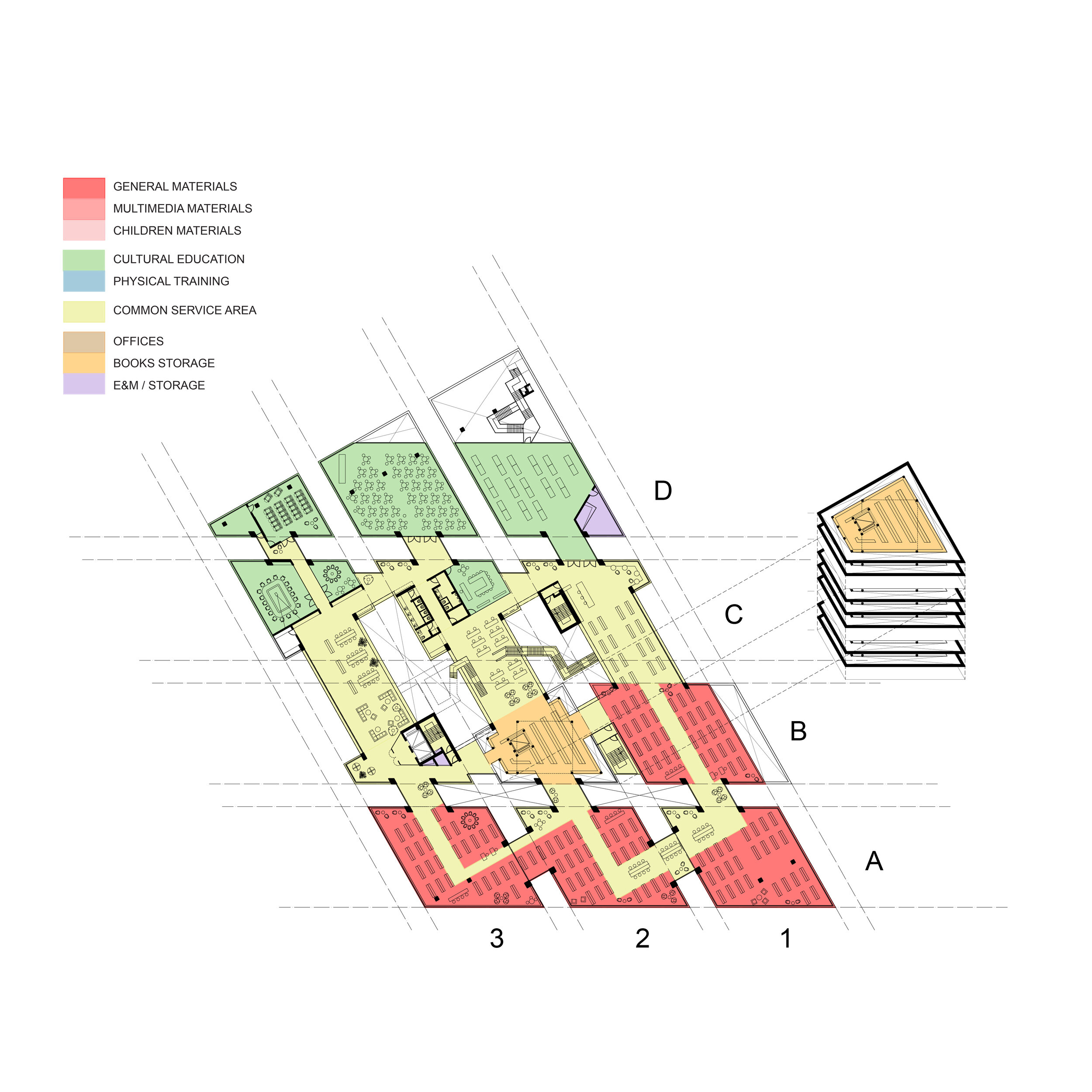
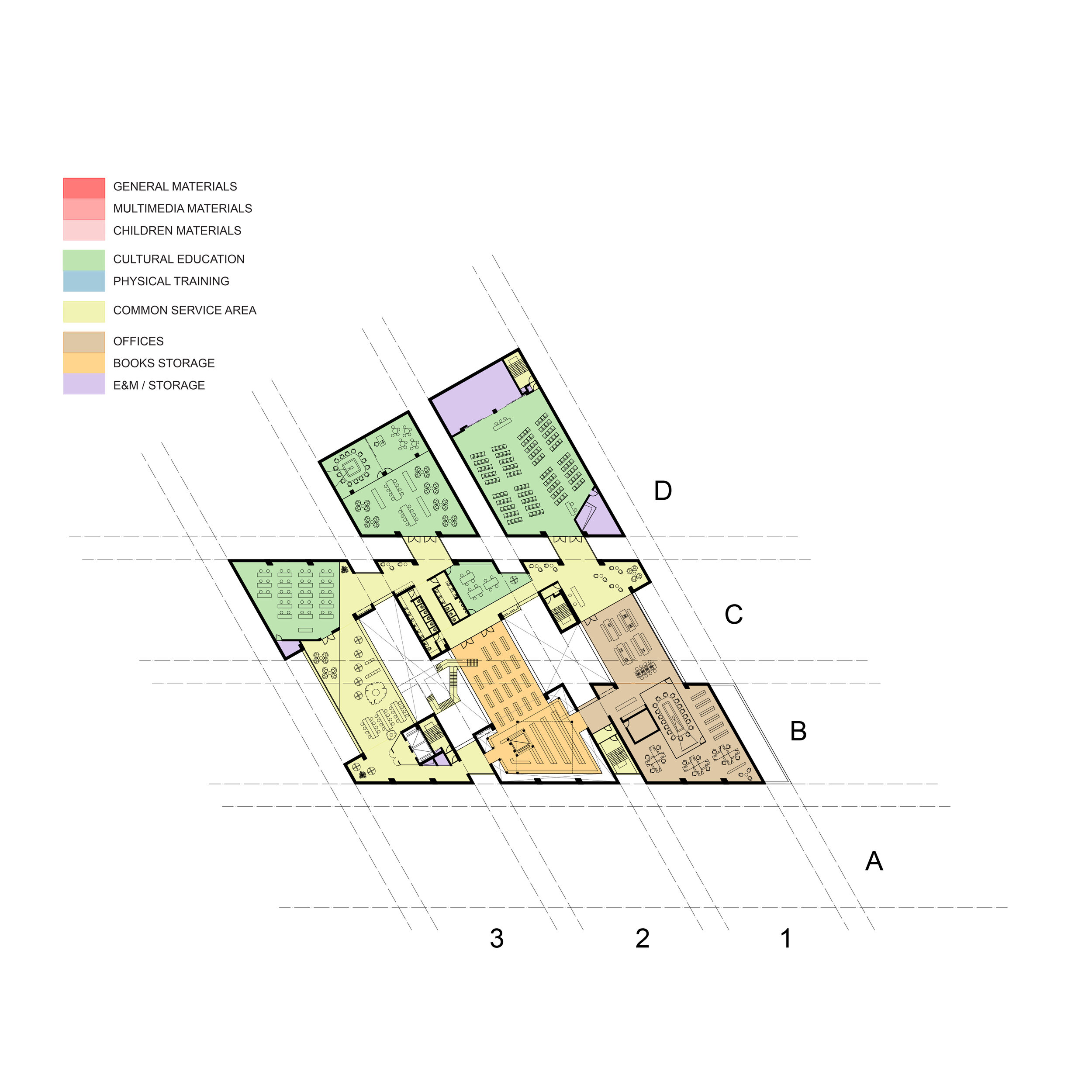
The plan of the library is devised using this structural rationale, the lines of the poem represented as a matrix of blocks. The three lines of the poem form three rows of four feet: four clearly defined blocks, the blocks representing the syllables. The number of syllables defines the height of each block, five syllables will relate to the basement, ground and three above ground storeys.
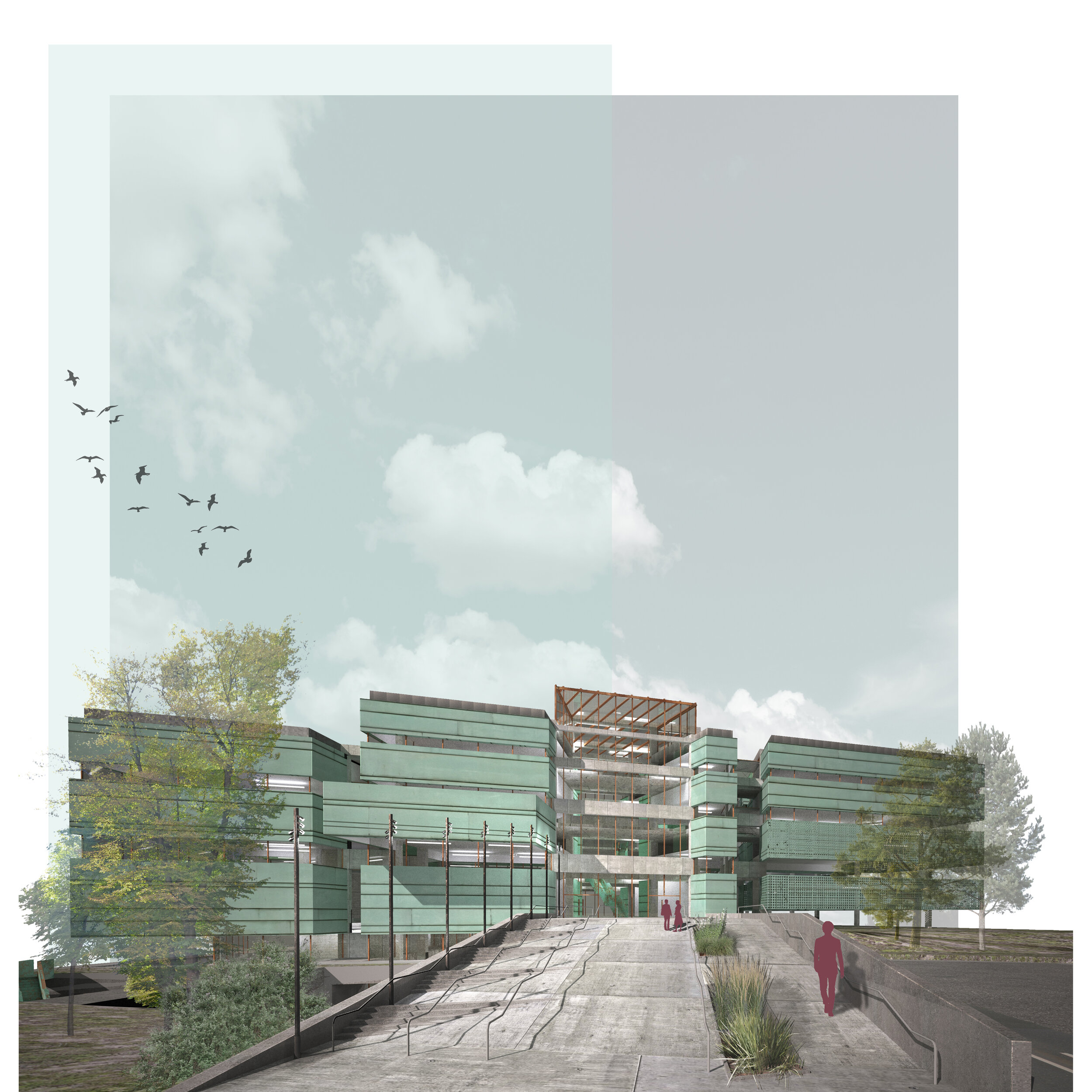
Line 1 forms the main entrance to the building (the introduction) and becomes pastoral through the creation of an internal wooded garden on the existing hillock to the north of the site.
Line 2 develops the theme of the library and houses the book storage facility in the centre of the plan.
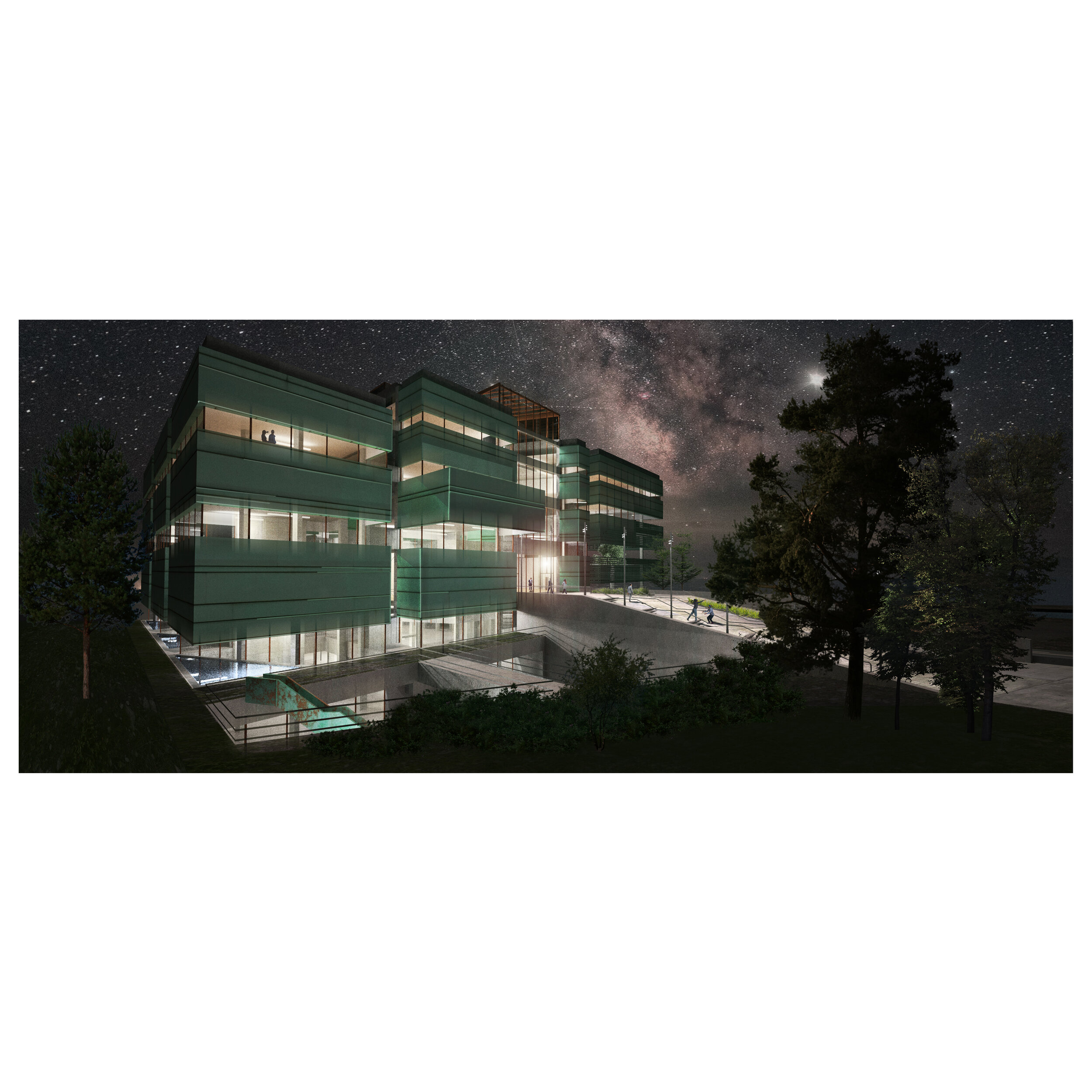
Line 3 forms the counter theme and also the secondary entrance. The second syllable of the line is 5 storeys high and thus the vertical element in a horizontal composition – a surprise.
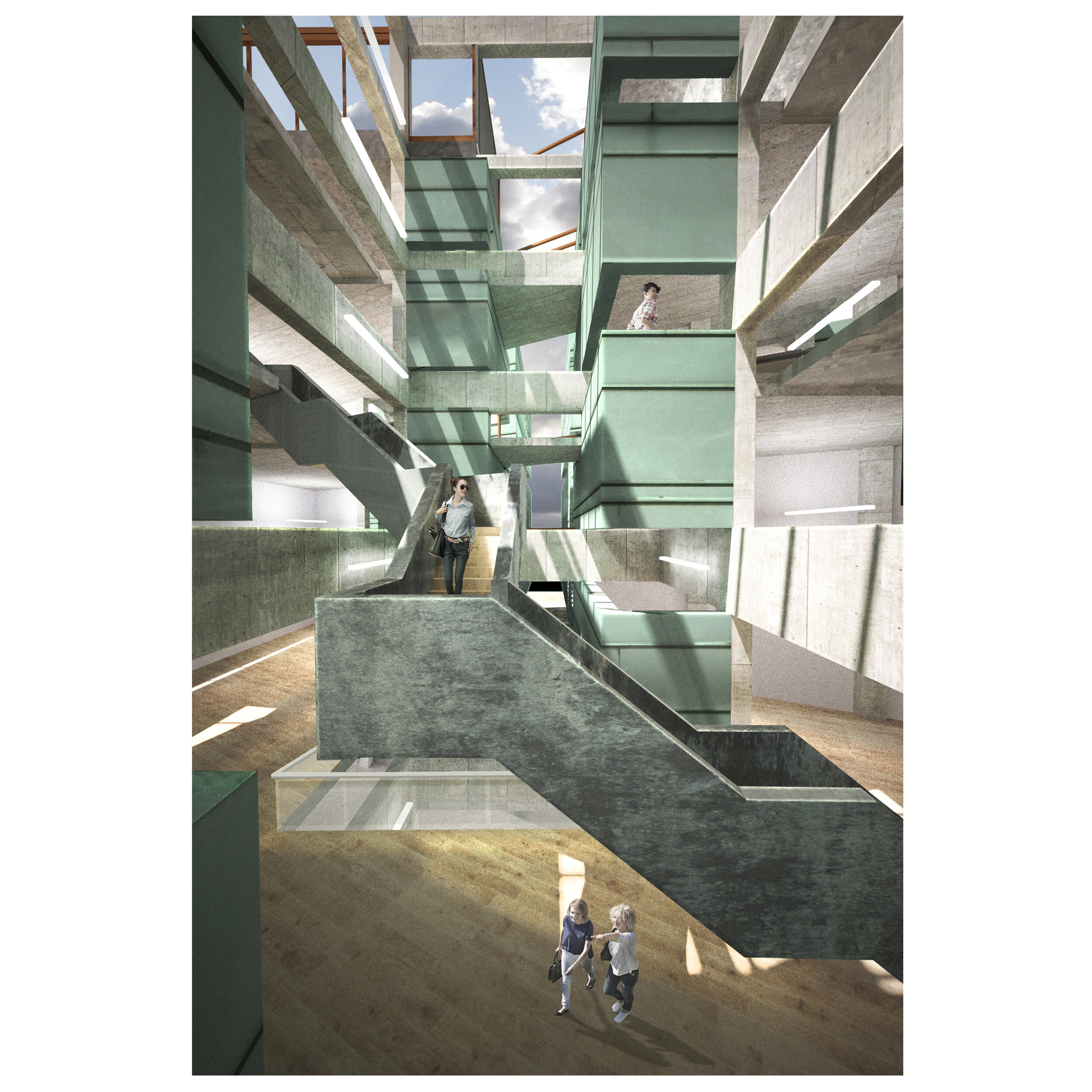
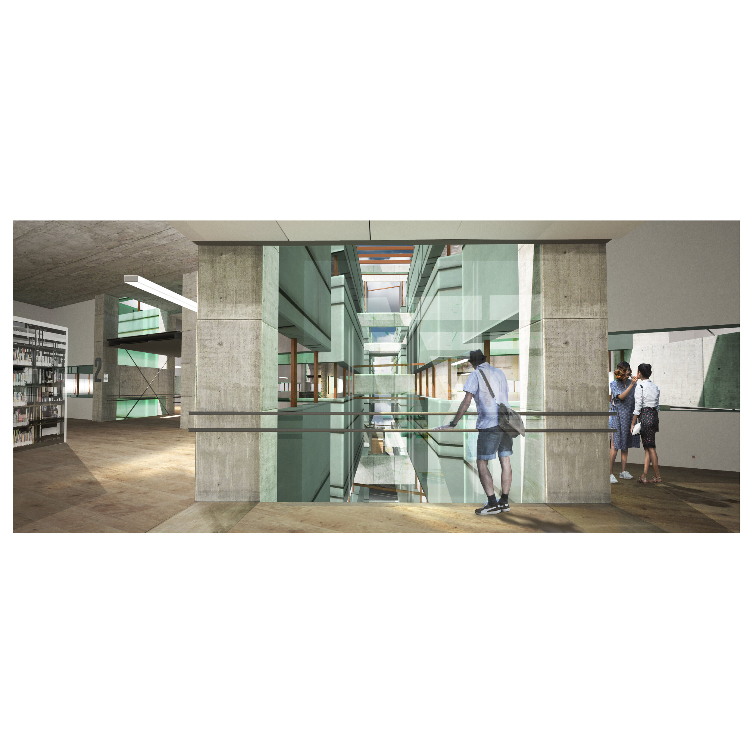
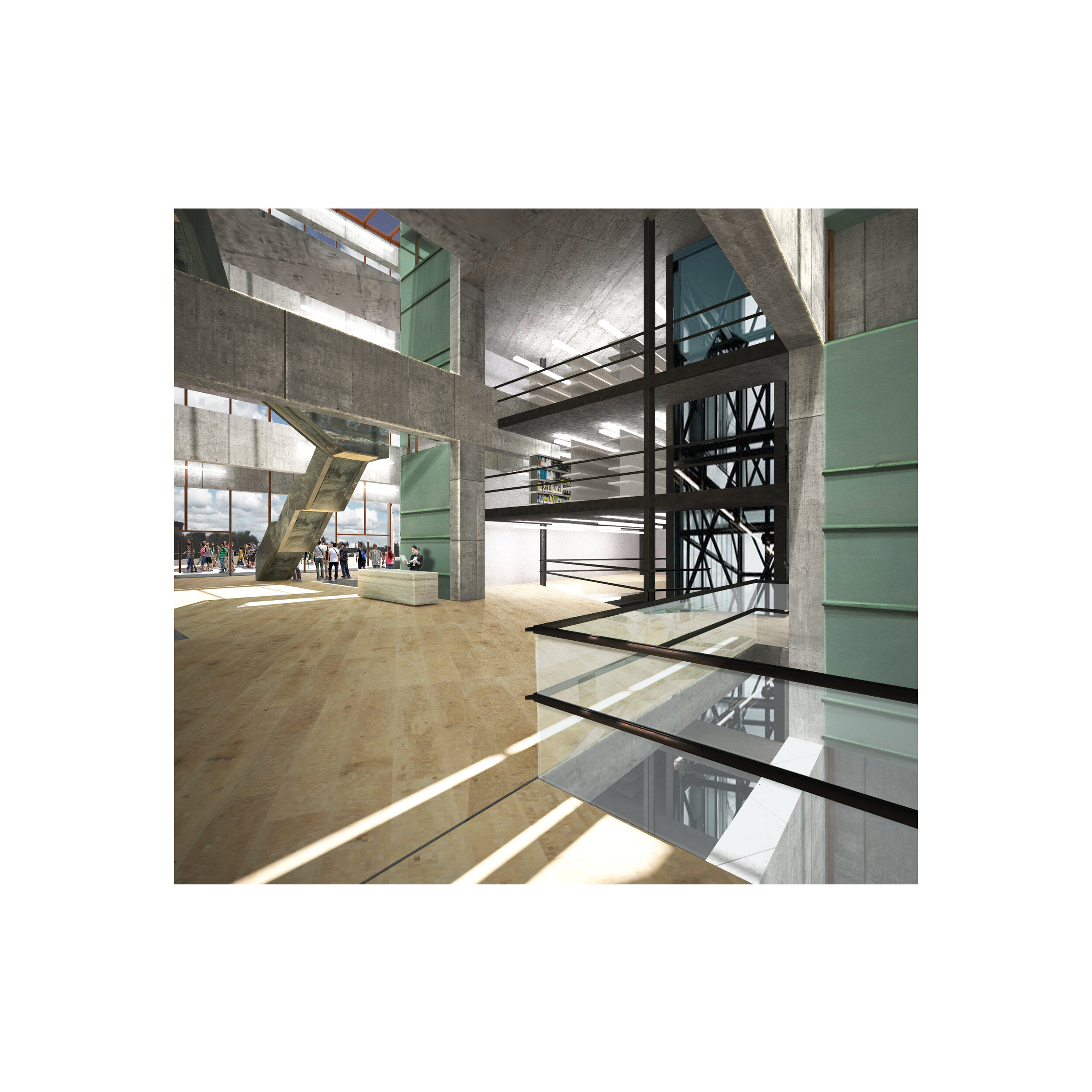
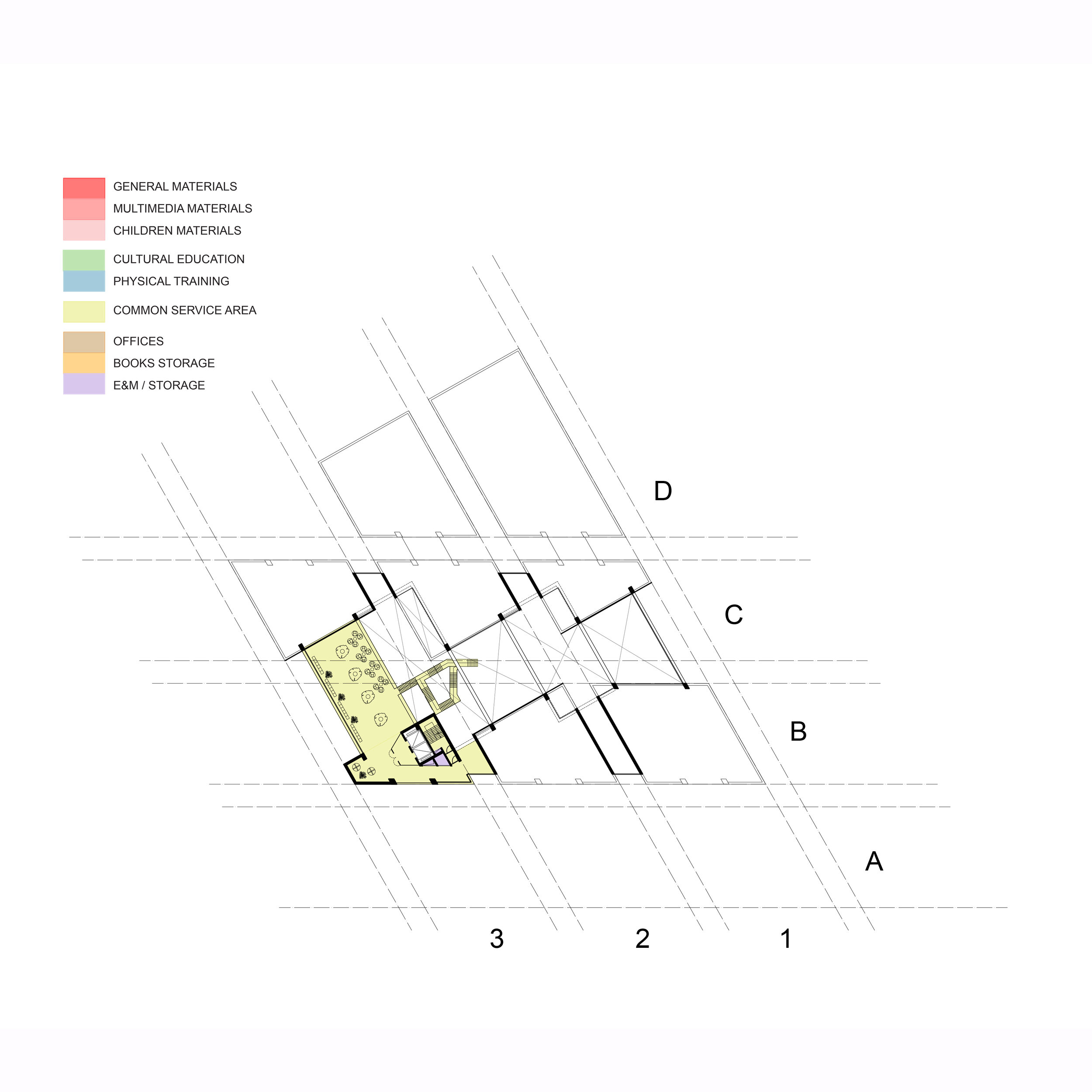
Each line has a pause near the middle that together forms an atrium and a central circulation space for the building.
The blocks form receptacles for function, a categorised bookshelf for storing the uses of the building. The space between the blocks provide an interstitial space, some internal, some external that enable the user to inhabit the space between the functions and allows living space for social interaction. The library of today is intended as a place to learn but also critically a social experience, meeting and interaction, something lost in today’s media orientated world. Library becomes meeting space.
Traditionally sijo poems were written and performed by kisaengs. These were women from the lowest class of society, barely above beggars but selected at a young age for their talents and trained to work for the government as a poet and performer. Despite their low class the kisaeng were highly respected as educated artists and even though social stratification was heavily enforced, the fact they could create artwork that could impress the upper classes was remarkable. The notion of the library exemplifies this idea, learning for everyone, free of charge and inclusive. Full participation.
The gridded matrix represents a microcosm of the city: it has a fundamental relationship with, and is a spatial response to the urban condition. The plan is reminiscent of a Nolli plan showing the functional plots but more critically the spaces in between, the public realm. This analogy is taken a step further by envisaging it in three dimensional space, allowing the user to inhabit the building in a more abstract way, either inside these programmatic vessels or caught between them in the interstitial space.
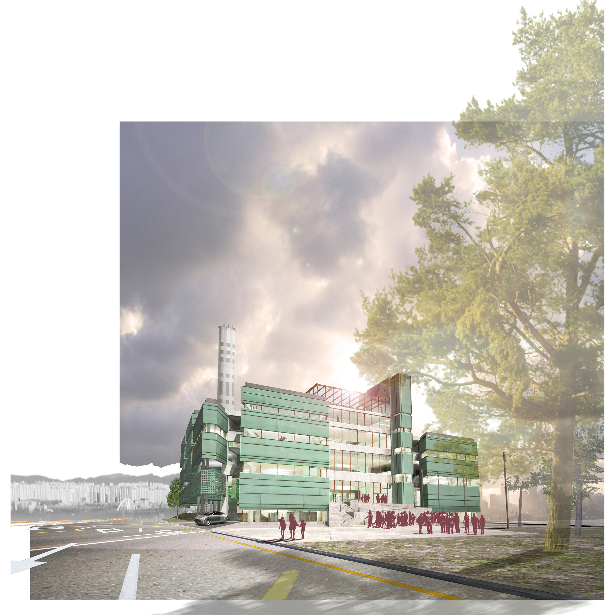
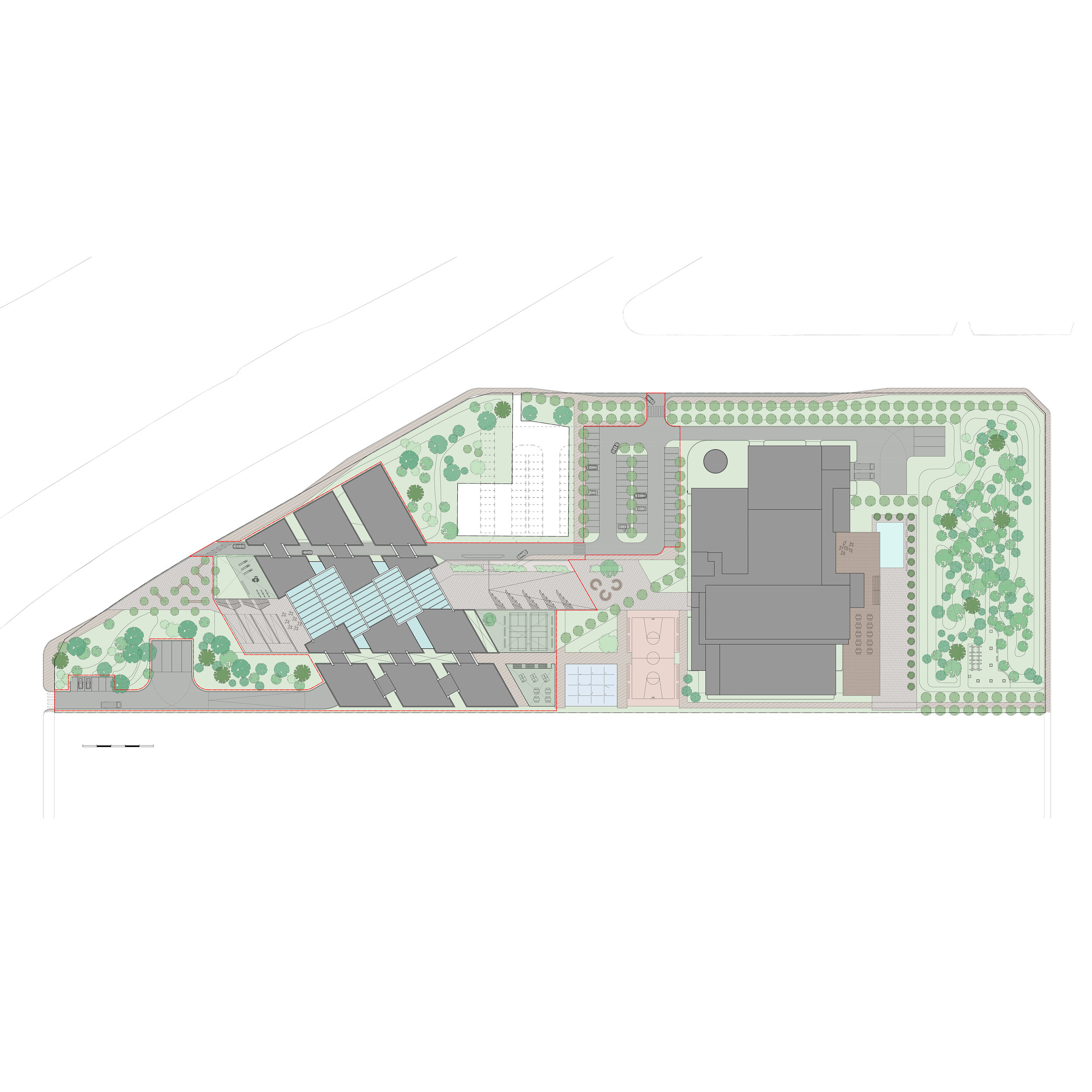
The building bisects the western portion of the site maintaining a relationship with the highway and streams on the northern edge while allowing for the future possibilities of the site directly to its south. Arriving by car from the west, the access road cuts directly through the building allowing the visitor an intimate experience of the library before even parking the car. The central area of the site is programmed as a generous public square setting up a close connection between the library and the existing incinerator building. An axis is defined cutting through the new atrium and focusing on the old chimneystack as a site signifier.
Parking is located to the middle of the site adjacent to the heat generation building to serve the library and the future uses of the incinerator. Parking can be extended into the site of the heat generation facilities at a later date. A disabled drop off area is positioned at grade under the main entrance ramp to the east of the library taking advantage of the four metre level difference between the street and the entrance lobby while also enabling a separate entrance for the physical training areas in the basement.
The function of a library has developed beyond that of merely books and the written word. It now becomes the relational library, a place of learning, of culture, of technology, and crucially a living space for the user – a place of social interaction. The Phase 2 use for the incinerator building can reinforce these notions and ideas. The reimagining of the incinerator envisages many uses, which support the new library. Initially the proposal would be to relocate the physical training aspect of the building in the basement to the incinerator to allow for expansion of the library functions and perhaps even a theatre space or screening rooms. Within the incinerator the physical training possibilities could be much greater.
The incinerator would also house more community functions that support the social experience; expanded makerspace and workshop areas allowing users to gain knowledge of crafts, fabrication and making. Artist workspaces would be available for hire on a daily or annual basis to encourage community creativity including personal artistic endeavour as well as performance art and experimental theatre.
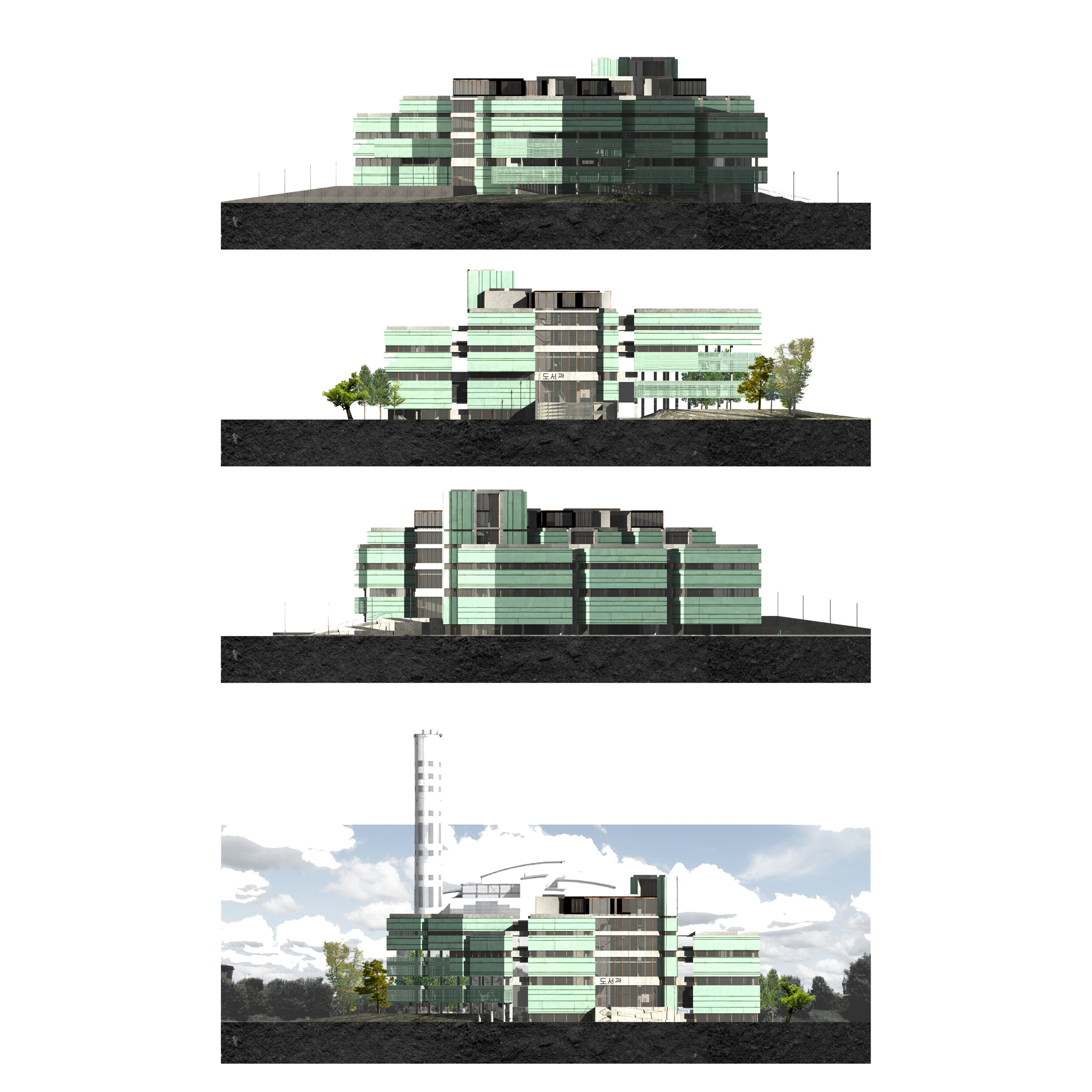
The materiality of the library building is a restrained and simple pallet. An insitu concrete framework is left exposed as an honest expression of the building’s structure. Copper cladding is the main material throughout. Clean, warm, golden copper is used for window frames and specific details; elsewhere the green patinated hues of oxidised copper finish the blocks of the buildings form. The blue-green colour of the patinated copper is reminiscent of the painted soffits on the roofs of Korean traditional buildings, which are often a bright, vibrant green colour. A warm timber floor throughout the library softens the pallet and provides a more personal experience of the interior.
